
Pencil and brush strokes started in la Habana, Cuba, have traveled miles and time to Time Magazine covers, canvas, and now the new Spoon album. Edel Rodriguez, originally born in Cuba and immigrated to the Miami, U.S., has been practicing his craft since his childhood and his latest works are sprawled across record stores on indie/art-rock band Spoon’s tenth studio album.

The latest Spoon album stood out before even two singles were streaming thanks both to the Britt Daniel fronted band’s consistently catchy and must-dance elements, but also thanks to Edel’s strong artwork.
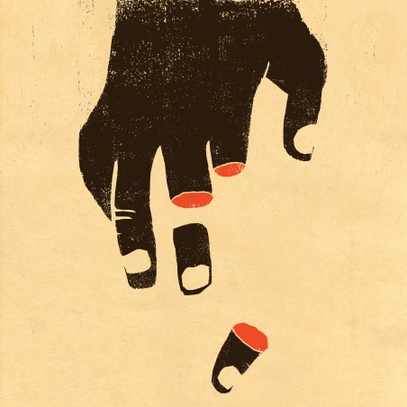
The three-color palette is bold. It’s daring. And it demands attention. But long before this album came out, Edel Rodriguez’s artistic motifs and style have been a loud voice in major conversations in the world.
Take for instance his 2017 cover of Time Magazine where he depicted the then U.S. president as draping a U.S. flag over a Nazi saluting hand. The image was powerful at the time as it is now, depicting the intolerance and schism in U.S. political factions.
His work has always centered on pop-culture. But in Edel’s work, pop-culture and the political blend. Whether it be illustrations of Jimi Hendrix, portraits, or political figures, his work is starting a conversation.
The covers of the newest Spoon album and its singles that Edel Rodriguez created are no different. Consisting of contrasts of bold reds, dark whites, and light blacks, these new works center around faces or masks from the African/Afro-Cuban diasporic religion of Santería.
The boldness in color translates to boldness in success. It’s for this reason that these works will be featured by the Society of Illustrators for their annual exhibition opening in New York City next month in March.
This interview was done via email. The newest album of Spoon’s, Lucifer on the Sofa, is out now via Matador Records. You can see more of Edel’s work at his website.
Antonio Villaseñor-Baca: So before we get too much into these latest works and the Spoon talk, I want to ask a little bit about you and your work. You have an interesting story but what stood out to me from your bio was this huge chunk was missing. You’re from Havana and came to Miami when you were young where you were introduced to American pop culture. Can you elaborate on that from your bio? What exactly influenced you and how? Do you remember any large references or subjects of pop culture that resonated with you more?
Edel Rodriguez: Everything was different in the United States, music, television, films, food. I grew up in a Communist society with no advertising or private companies, so there were a lot of new graphics that captured my interest when I arrived here. American pop music and rock and roll was something I had never experienced until I arrived here. Bands like Queen, Van Halen, Kiss, Metallica, those were all new to me.
How was it that you started drawing?
I first started drawing as a child in Cuba. My interest developed further in art classes in America. I went to college in NYC and studied painting and illustration.
I also saw on your IG stories that you visited Cuba a few years ago and that you did a series on that. From what I found, that series also included more colors in the portraits you did over there. What did that experience mean to you?
I had always wanted to go back to my hometown and spend a few weeks painting my friends and family, as a way to reconnect with them. WeTransfer sponsored the trip and sent a reporter with me to document it. Most of my friends had never had a portrait made of them so I wanted to do that for them as a gift. They are farm workers for the most part, and something like this meant a lot to them.
How did you find your color palette and style? The works for this Spoon album have very bold line work with strong reds and darker-hued whites and black. But these motifs appear in a lot of your work. Is there a significance behind them?
I started working with red as a dominant color in some of my work about 25 years ago in college, for my MFA thesis exhibition. It’s a color that has been used heavily by oppressive political systems, like Communism, for propaganda purposes. I wanted to reclaim it, to give new life and personal meaning. The color also has associations with blood and mortality, themes that I often touch upon in my work.
There also seems to be this strong imagery of what almost seems like African masks or more indigenous faces in your work. Would you agree with this? If so, can you explain their symbolism and your connection to them?
I grew up surrounded by the rituals of the Afro-Cuban religion, Santería. Masks, sculptures, red and white ribbons, flowers, cigars, blood, and animal sacrifices are all part of it. Some of my images reference a bit of that upbringing.
Your website lists “Socialist propaganda and Western advertising, island culture and contemporary city life” as influences or themes in your work. Can you explain how you channel these topics for your work and why?
I look for ideas and imagery from the places and events I’ve experienced. Growing up under Communism made me want to subvert some of its graphics. Living in a small island town and in the largest American city, are complete opposite experiences. I try to combine the two in my work and see what comes out.
One facet of pop culture that I saw in your work was the illustration of Jimi Hendrix for the book cover you did. I have to ask about your process for that piece. Are you a big Jimi Hendrix fan? What did that project mean for you?
I first heard Jimi Hendrix’s music in high school and became an instant fan of his music. The book is made up of over fifty full color pages. I loved working on the project. Jimi has wonderful gestures to work with. The cover was done with acrylic paint, oil based inks, and digital techniques.
Okay, now to Spoon. So Lucifer On the Sofa came out today and has your artwork all over. How did this collaboration work? Have you always listened to Spoon?
I’ve been a fan of Spoon going back to the 90’s when they released their first album, so it was amazing to hear from them. Britt Daniel reached out about the possibility of creating an album cover. I suggested the idea of creating a series of images that could be used on the singles and for other promotions such as t-shirts and posters. He was onboard with the concept and we went ahead with it. It was a pleasure working back and forth with Britt until we nailed down the whole album package.
How long did you work on this series? How much did the music influence the work?
The lyrics and music had a lot of influence on the work. I listened to all of the songs and read over the lyrics as I developed the image. The lyrics are very visual, images and settings seemed to come to me right away. I think I worked on the whole series off and on for about 3-4 months.
All of the illustrations from the album were selected by the Society of Illustrators for their annual exhibition opening in NYC next month. Congratulations by the way! Your work has been featured all over the place, like Time Magazine, to name drop. What does this honor mean for you?
It’s wonderful to see a great project get noticed by my peers in the industry. The entire package looks terrific so I’m very honored to have it chosen as one of the best projects of the year.
By Antonio Villaseñor-Baca
One thought